
Why Employee Satisfaction Isn’t Enough
For years, the name of the game for managing people was employee satisfaction. With a changing labor market and higher employer standards, that focus is changing.

Source: Wikipedia
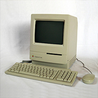
Like many entrepreneurs, I bootstrapped funding for my first business. Part of saving money meant doing everything myself, including (shudder) building our first office computer. Of course the established firms had no time for such nonsense - they purchased cutting-edge machines that looked a lot like this:
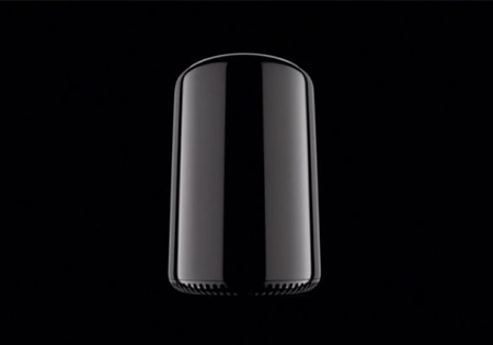
Over the years we’ve seen the PC industry evolve, with increased power, decreased size, and a radical change in how we interface with our computers. What was once a “function over form” industry has transformed to a marketplace of contemporary design and elegance. To illustrate my point, here’s a photo of Apple’s new “desktop” computer:
Source: cultofmac.com
So what’s going on here? Certainly, some of this transformation is driven by cheaper and ever-shrinking technology. CAD and improved fabrication methods such as robotic machining and 3D printing are reducing design timeframes, enabling a faster concept-to-market cycle.
But, beyond the obvious changes in means and methods, the PC photos above illustrate a critical cultural shift: namely, that our expectations around design and human interface (how we work with things) is accelerating at an exponential rate. Great design is no longer the exception, but rather the norm. And this goes not just for the retail consumer – indeed, we’ve reached a critical point in the evolution of B2B marketing where the business buyer has become a design buyer.
Design has always been a part of the human experience, fulfilling both functional and emotional needs. From cave paintings to the New York skyline, our visual experience is a merging of pragmatic needs with artistry and emotion. But, there’s a balancing act: a church is much easier to build with short ceilings and no windows…but inspiring the faithful is a lot easier with heavenly views and vaulted ceilings.

Yet despite centuries of elegant design (often expressed in architecture and fashion), accessibility to aesthetics was largely limited to the wealthy and powerful. Millennia of extreme wealth concentration meant that most of the world was more concerned with putting a roof over their head than they were with the “luxury” of beautiful objects, art, and architecture.

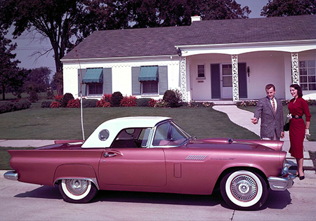
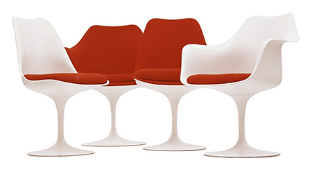
The rise of the middle class and mass production meant that the mid-20th century marked a powerful paradigm shift: in America and elsewhere, design was no longer the exclusive province of the ruling elite. High art, fashion, and industrial design moved from gilded halls to the living rooms of America.
Source: carculture.com
Source: Wikipedia
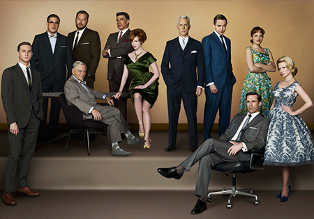
Source: AMC
Obviously, this summary compresses a significant amount of time. But, within these examples, we see the dramatic increase of design accessibility. In fact, from the 1950s onwards, consumers have become attuned to a higher and higher level of design expectation. Put into a graph, it might look something like this:
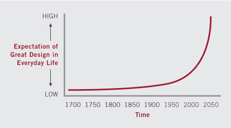
As I mentioned earlier, mass production, wealth distribution, and technological advances have led the way in making great design available to a broader swath of the population. But these factors are just a piece of the puzzle. Businesses across industries are using design as a competitive advantage, even for mundane activities, like:
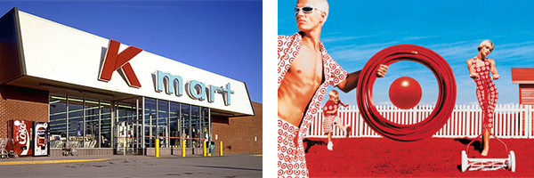
Been to K-Mart lately? Probably not. And, there’s a good reason why – they’ve failed to adapt. Target, on the other hand, has been a brand-leader, declaring on their website, “…great design should be affordable and accessible to all.”

Remember these? Yes, some of our readers probably wonder what a “card catalog” is, as Google has forever made obsolete the idea of searching through stacks and stacks of cards (or, maybe even books…I shed a tear at this point). Either way, User Interface (UI) design has changed what we expect when looking for something – we want it fast, relevant, and easy to share.
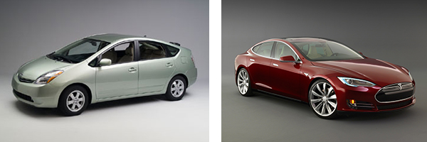
Sources: Toyota Prius & Tesla Model S
While Toyota made big strides in electric car technology (Prius, 1997), The Tesla model S demonstrates that being eco-friendly and design-conscious needn’t be mutually exclusive. Oh, and then there’s the matter of 0 to 60 in 5.4 seconds…
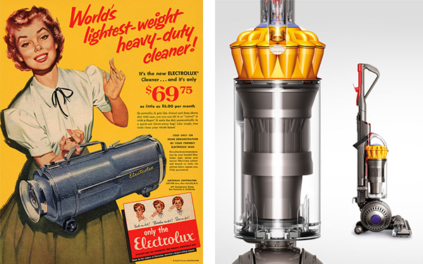
Source: Dyson
Dyson is reinventing the vacuum cleaner…and all sorts for things like heaters, fans, and hand dryers…
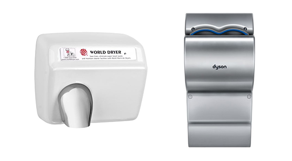
Sources: World Dryer & Dyson
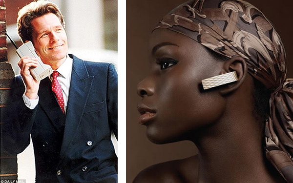
Sources: Daily Mail & Jawbone
Remember the “brick” phones? Cell-phone-as-fashion has certainly come a long ways…
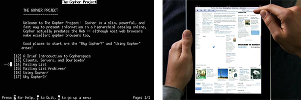
Source: awesomedc.com
Hard to believe that one of my first jobs had a connection to the “internet” through the screen on left… “Gopher” was THE browsing tool on our 14k modem.
So how does the evolution of visuals relate to the B2B customer? To better understand how business buyers are becoming design buyers, let’s look at what was once an iconic B2B organization: Blackberry.
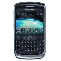
Two years ago I wrote about Blackberry’s misguided efforts to use marketing to cover up their lackluster product design. The bullish CEO, Thorsten Heins, declared the company didn’t really have a problem with their phones; all that was needed was better marketing (cough, cough…).
Of course, Heins couldn’t have been more wrong: last Friday, the pharmaceutical company, Pfizer, announced it would end its relationship with Blackberry and encourage its 92,000 employees to use Androids or iPhones. The US Department of Defense (DOD), owner of 470,000 handsets, is readying a contingency plan for migrating away from the floundering company. As a result, Blackberry’s already anemic stock crashed to barely $6 per share, down from a high of $236 in 2007. Industry analysis is now focused on how Blackberry’s only real value is in selling off the company’s patent portfolio. How depressing.

Source: Google Finance
It’s easy to point fingers with the benefit of history – most critics blame Blackberry’s failure on its inability to move into the consumer market. After all, as we see in the Pfizer and DOD example, Blackberry’s original focus (and last bastion) was the business segment.
In truth, however, the behemoth’s downfall wasn’t about missing out on retail buyers, but rather the result of their inability to bring design to its business customers. The organization – with two CEOs(!) – stood tone deaf to the, “‘Consumerization’ of business technology.” Here’s how the New Yorker puts it in a recent piece:
…When BlackBerry users returned home and pulled off their ties (and heels – my addition), they picked up iPhones, which were a lot more fun to use. Soon, they wanted to use iPhones at work. Simultaneously, companies realized that workers would be happier and more productive buying the device of their choice, and the firms themselves, spared the expense of providing their employees with phones, would save money.
Sadly, Heins isn’t alone in missing this new “design reality” – peers like Microsoft’s CEO, Steve Ballmer continued to treat business buyers like second-class citizens. Here’s Ballmer laughing at the price of the iPhone and dismissing its viability to business customers because it lacked a keyboard:
Of course we all know how that story played out – Apple dominates the enterprise phone market, with some studies showing a 70/30 split between Apple’s iOs and Android operating systems… Windows-based phones barely register. Ouch.
As the Blackberry tale shows, failing to adapt to the new design reality has consequences. No, it’s not something felt overnight – failing to evolve is typically measured in years, rather than months. But, increasingly, the heightened design expectations we see in the consumer space are making their way into the B2B buying process. Purchasers evaluate your company on the quality of your website, the coherence of your messaging, the professionalism of your LinkedIn profile, and even the quality of your blog posts.
And, in case you like bulleted lists, here 3 simple reasons why you should take a fresh look at how beautiful (or ugly) your brand is:

Source: Disney
If you’re an owner and aren’t confident in your brand image, chances are it’s lacking. Getting an outside, objective perspective is the best way to evaluate the state of your brand (as the saying goes, “It’s hard to read the label from inside the bottle”). But, if you don’t have a talking mirror nearby, here’s a simple methodology you can use:
Hopefully you’re reading this and already understand the value of a strong, well-designed B2B brand. Maybe you’ve even had the foresight to be a brand leader in your market and are the envy of your competitors. If so, congratulations!
But, whether you’re a current brand leader or a rising star, remember that leadership is a journey, not a destination. After all, Blackberry once held the esteem of the world. By the end of the year, it’s likely their stock won’t be worth the paper it’s printed on.
Want to make sure you receive our latest marketing and business strategy articles? Be sure to sign up for Kinesis Growth Tips in the right sidebar of this page. We also welcome discussion; if something from this interview sparks an idea, thought, or comment, post away…
Get insights like this straight to your inbox.