
Why Employee Satisfaction Isn’t Enough
For years, the name of the game for managing people was employee satisfaction. With a changing labor market and higher employer standards, that focus is changing.

*Note: This is Part II of a two-part series. Be sure to read Part I to learn how to balance company maturity and website sophistication in your website budget.
Last time on the Kinesis blog, we discussed the vast universe of website budgets - and how to "find your orbit" when it comes to balancing cost and performance.
The fact is, as a growing business every penny counts on the P&L - and it’s tempting to go the route with the fewest zeros on the price tag. (Although to be fair, sometimes affordability shouldn’t exactly be your chief concern… like when selecting a heart surgeon, for instance, or buying a parachute.)
Whatever your budget, before making any website investment it is critical to consider two important factors: your company's maturity, and your website's necessary sophistication. Fortunately, we created this helpful infographic to help you calculate your ideal website spend (and "find your orbit") based on these criteria:
Today, I'd like to hone in on one particular category of this galactic discussion: "Life-Sustaining Planets" (or, websites in the range of $25k - $150k). As we've mentioned, this investment is right for small- to mid-sized businesses with a strong understanding of customer value.
But what does that investment go toward, and how are these websites different than their celestial siblings? Let’s explore what this category means for your website and your business.
Last time, we talked about the website budget "Danger Zone" - where you often get caught spending too much money for the end product, but still not enough to see an ROI. This is the veritable asteroid belt of the website cosmos: difficult to navigate, and with a high likelihood of disaster.
When embarking on a website project, how can you be sure you're getting the bang for your buck (and avoiding the Danger Zone)?
To help answer this question, we've put together a list of five key elements that go into a well-built website in this price range: Strategy, Architecture, Design, Content, and Evolution.
Note that this kind of depth shouldn't be expected with a "Dwarf Planet" website (when cost is prioritized above all else). However if you're looking at a moderately priced website, here is what you and your website partner should be thinking about.
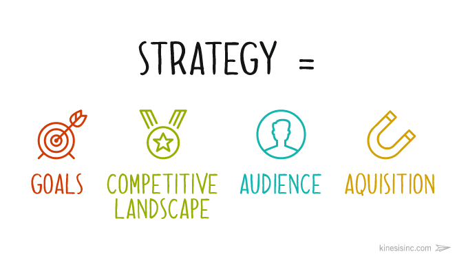
Goals: Working with a strategic partner means starting with the question: What do you want your website to accomplish? An ecommerce site will want to generate as much direct revenue as possible, whereas another company may want to display a portfolio of their work, or act as a central hub of information. Whatever the case, start with the end goal in mind.
Competitive Landscape: It’s also important to know where your company fits into the ecosystem around you, so you can differentiate among those competing for your customers’ attention. A comprehensive website process should include a competitor website analysis – to help you understand where positioning opportunities lie.
Audience: This means honing in on your key website users in persona-level detail – including both primary audiences (like prospective clients), but also secondary (like job candidates, vendors, or partners). What are their goals when they land on your site? What state of mind are they in, and what information are they looking for?
Acquisition: In addition to thinking about the users themselves, a good website will consider how those users will arrive on the site – be it through search, email, via an industry directory, social media, etc. – and have a relevant strategy for each channel.
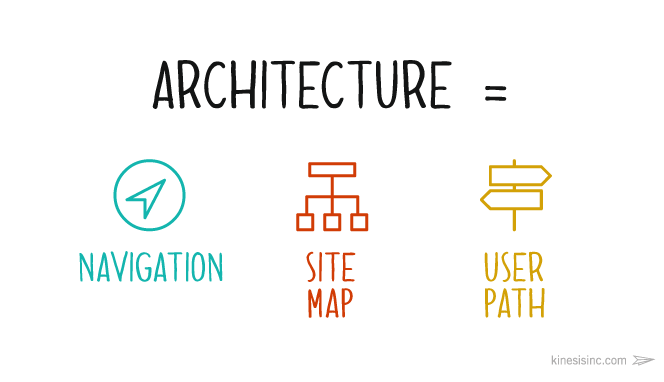
Navigation: Ever gotten frustrated on a website because you couldn’t find your way around? So have your users. In fact, Forrester Research estimates that roughly half of potential sales are lost because users can’t find the information they’re looking for. A well-built site will be easy to navigate, and won’t leave your users feeling angry or confused.
Site Map: Similarly, the pages on the site should be well-organized and hierarchical – so that it’s clear what the site communicates first, then next, then last. This page structure should be obvious enough that your user spends three seconds or less searching for the next link to click.
User Path: Likewise, which link they click should be an intentional decision on the part of you and your website firm. Users should be guided smoothly through the site based on priority of information – and should always have a clear next step (i.e., no “dead ends”).
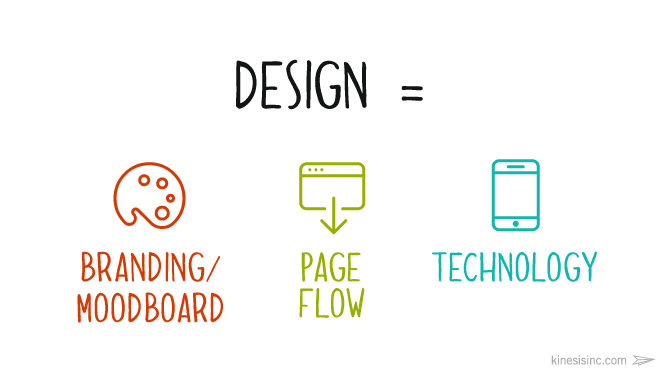
Branding / Moodboard: It only takes 50 milliseconds (that’s 0.05 seconds) for users to form an opinion about your website – which means it better look good, fast. Your brand should tell a story on your site with deliberate and consistent use of logos, brand colors, textures, fonts, graphics, photos, iconography, and stylistic conventions.
Page Flow: Good design creates a clear hierarchy of information, drawing the user’s eye to the next content block smoothly – whereas bad design overwhelms the user with too much information at once.
Technology: The site should also consider the top browsers, screen resolutions, and device types used to access it – and ensure that the site design and user experience is consistent across each of them.
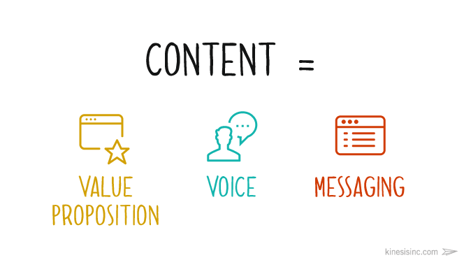
Value Proposition: 86% of website visitors want to see information about products and services immediately when landing on your site. That includes not only what they’ll get by working with you, but also why you’re distinctly better than their other options.
Voice: Your company has a personality – and working with you is a distinct experience. Would you like your business to be known as friendly and approachable, by-the-book professional, or both? Whatever this voice and personality, it should come through in your website content.
Messaging: If your voice is how you say something, your messaging strategy is what you say to begin with. What is your overall communication strategy on the site, and what key messages to you want to convey?
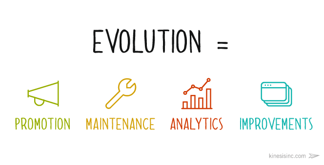
Promotion: Of course, a good site won’t just sit unannounced – a website redevelopment is a good excuse to shout your brand from the rooftops, and let your network know about the investment you just made into their experience. A good website package will include this outreach, to ensure no touchpoint opportunities are missed.
Maintenance: Anything worth having is worth taking good care of. Any website requires regular upkeep – including bug fixes, plugin updates, and general code preservation. Select a partner whose package includes this ongoing care of your site.
Analytics: These days, keeping a regular eye on your site’s performance should be a standard component of any website package. Leverage this intelligence to better understand your user base and modify strategy.
Improvements: Once you gain these insights into website traffic and user behavior, your website should be continually evolved and improved. Make sure your site is on the cutting edge of any relevant trends and constantly perfecting your user experience.
And as always, any investment should be made based on the potential return on that investment. Whatever your business size and goals, select a partner and program that’s right for you - and watch your website go from a tactical afterthought into an engine for growth.
Interested in seeing some of Kinesis' recent website redevelopments? Check out some of our favorite rebrands from 2016.
Get insights like this straight to your inbox.